Seeing Beauty Differently: Abstraction, Color, and the Power of Design Strategies
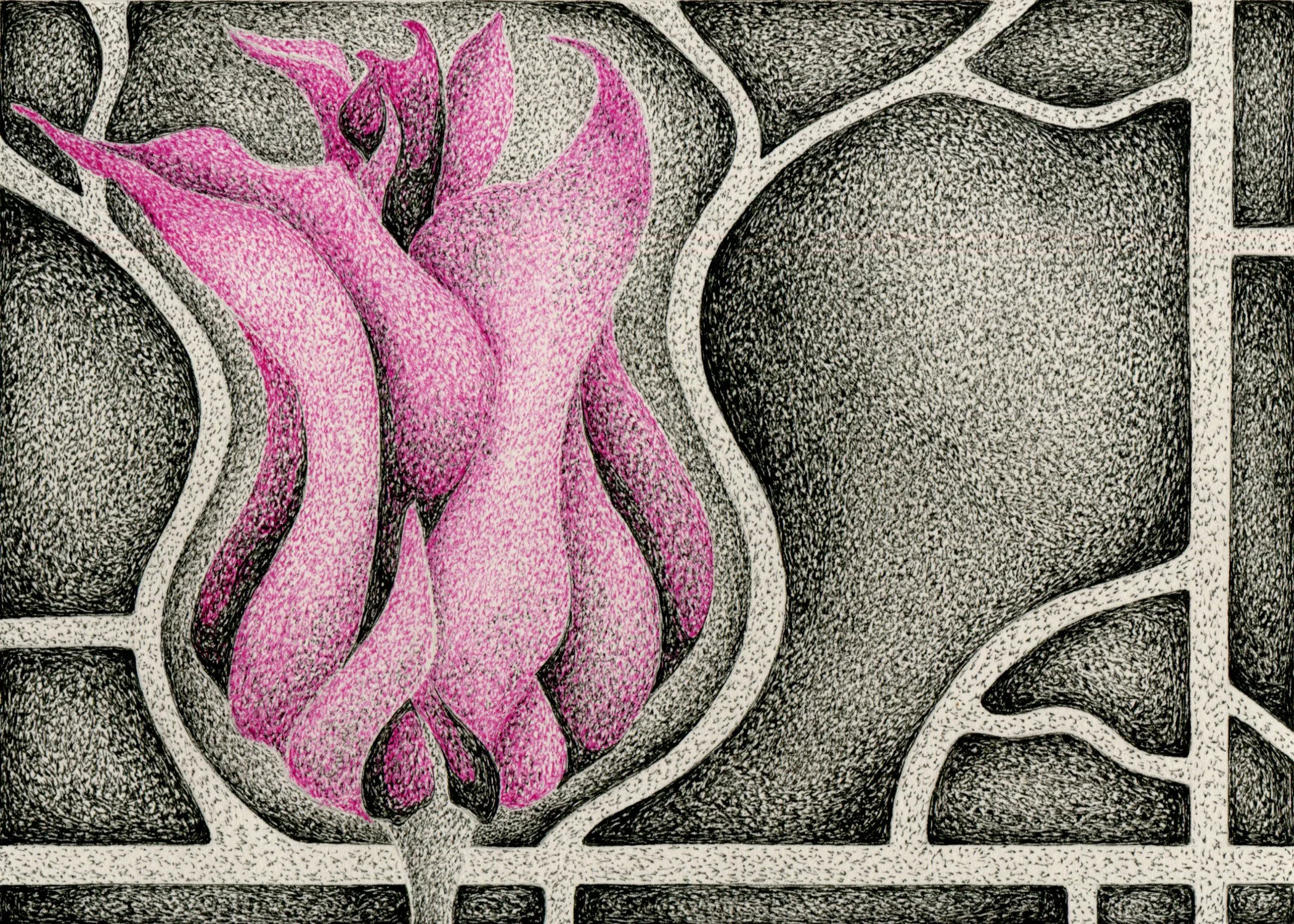
Pen and ink contemporary fine art by Doug Ashby.
I am sure that in your time here on earth you have encountered the notion that beauty abounds. In many ways this is a choice in terms of perception. Beauty does exist everywhere, just as its opposite does. Therefore it is a choice whether we see it or not. I have long felt, mainly through experience, that art serves to bear witness to this choice and is a vehicle that opens a doorway towards seeing more deeply. The artist in many ways is the perceptual reframer. As an artist I strive to have my work serve the viewer in such a capacity. The above artwork is a simple and straightforward attempt at that. Abstracted just enough to give a moment of pause and reflection. This essay will also endeavor to illuminate some of the design strategies I employed to achieve the goal.
My daughter asked me, while creating this artwork, what type of flower I was drawing. In short I said “perhaps a tulip.” The truth though is it’s an amalgamation of the bountiful diversity on display this time of year. A perception of all that I see. So within that I created something that is recognizable, yet not directly discernible. Realism is only something I choose to flirt with as an artist. In much the same manner realism, in an artwork itself, is something that I personally have never connected with. That is unless it's photography. I have always preferred art that abstracts nature in a way that forces me to alter my perceptions a bit. I desire to see, and interpret, what the artist is trying to communicate in their very personal and creative perceptions.
In this artwork I am purposefully, for creative reasons, breaking with my norm of pure black and white. There is a reason I choose to work mostly in black and white. It’s rather simple. I am color blond. Yet I know that there are moments where color will affect the outcome of a given work more powerfully than not. By choosing to make this flower pink I am attempting to imbue it with a life force that otherwise could not be rendered within the constraints of a value based grey scale. I wanted this abstracted nature to pop off the paper with visual energy and deeper emotional resonance. When I choose to work with color it is limited, somewhat due to my color blindness, but also as a tool that enhances a composition. It is a design specific decision.
As a teacher of art I give my students wide creative latitude in many ways, yet I also set out to constrain their work in order to develop a deep understanding of the elements and principles of design. These are a set of tools and guidelines that assist artists with their work. I like to say that the elements are the stuff art is made of and the principles guide our use of them. With that, in this artwork, I am employing the use of value, line and color, elements of design, and allowing the principles of emphasis movement and contrast to be my guide. Let’s break this down a bit.
The main thrust of this artwork lies within the use of color to bring emphasis. Otherwise known as a focal point. Intentionally using a brighter color against a neutral background makes the abstracted flower pop. However I did not want that to be massively overpowering so I tempered the rose micron pen with black, using it to a greater or lesser degree to create contrasting values. More on that in a moment. While color is the most direct element utilized to create value I must say that I am also using a size contrast. The flower is by far the largest thing within the art, in that I use a grouping of unified shapes to create a larger whole. I desired the flower to be the focal point, the emphasis of the artwork and have the viewer hang on that.
In the background I use the element of line, along with the principle of movement to flow the viewer's eye throughout the whole artwork, as well as to frame the flower. To achieve this I created a contrast in light and dark areas, values, to create the flowing movement. Incidentally this feature sometimes shows up in my work, previous ones being more of a pure abstraction, and the fluid lines are inspired from city planning architectural drawings. In essence maps. I have always had an affinity for the visual structures, natural/political, nature of map drawings and it shows up here in a subtle way that adds a dimension of movement and framing to the overall artwork.
Lastly I am using the element of value, areas of light and dark, along with the principle of contrast to create a wide range of light and dark areas. Both within the greyscale areas and the colored area. A former colleague of mine was a firm believer that contrasting values was the quintessential skill young artists needed to master, in order to improve their art. I am a firm believer in its power to create a more visually striking artwork and it shows up in my curriculum. I teach grades 6-8 and each year there is a lesson on using contrasting values that builds sequentially. These are my main go to design strategies within my personal art as well.
As I stated above I truly feel that the role of an artist is to inspire, in the viewer, a reflection point that brings about a change in perception. The artist communicates a unique interpretation of nature that opens new doorways of thought. This work serves as just that. It is, at its most basic, a representation of beauty within our world. Yet through abstraction and deliberate design composition I seek to broaden out further where beauty exists and more importantly how we co-exist with it. Throughout history art has had this dual mandate to inspire an emotional response that pushes our intellect forward, through communication. In addition it also serves as a valuable tool in educating us on visual literacy, particularly towards our ability to see and perceive patterns within our lived environments. This in essence is why I love art, create art, and teach art.
So I ask you, how has art personally reframed your perceptions and moved your thought process forward? Is there a specific example? My hope is that this artwork might have you opening up a little more towards your own surroundings. Seeing, perhaps for the first time, all the beauty that exists, or seeing things in a new and different way. Perhaps you see a different juxtaposition between the creations of nature and that which we create with and within. Sometimes it can be the most mundane thing that suddenly catches your eye and for the first time you are seeing deeper and more personally true. The simple beauty that abounds can be moving and transformative, if we are open and looking upward and outward.
As always I hope you enjoy the art and the writing. This original artwork is for sale. It is 5” x 7” and is $190. If you are interested reach out through my contact page. I would love to hear your thoughts on the art and essay so please do leave a comment. I promise I will respond.
Thanks,
Doug